I have been living in the Bay Area for just over a year now, and I’ve really enjoyed witnessing the full rotation of the seasons: Autumn had beautiful yellows and ambers and browns, the Winter – soft blues and greys, Spring – a verdant green with pinks and lilacs, and Summer is currently full of dry golden grasses, a muted blue sky and white clouds.
I really love it here.
One of the newest contributors to the greatest design blog on the web, Design*Sponge, is Lauren Willhite. She’s a Graphic Designer based in Portland, Oregon, and her blog, Color Collective is a treasure trove of loveliness. It’s been years now, but I’m still really gravitating toward the blue/green/grey combinations, with pops of warm colour like yellow and orange.
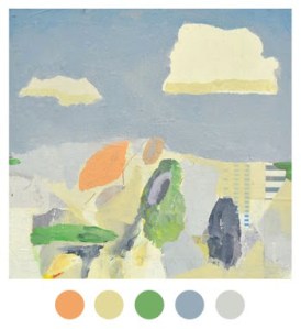
I love this combination because the greens and blues are balances out with the warmer tones of yellow, orange and bone. And how cool would it be to paint a room more than three colours?
This above is quite possibly my favourite pallette out of all the ones I have featured. I love the ‘pop’ the orange gives this work without dominating the blue and green tones and the yellow-based neutral. Compliments it perfectly. Splendid!
I love the inclusion of a deep, rich grey in this colour palette above. And I adore the ethereal quality of the photographs, too.
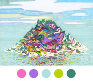
By using the pink and purple alongside the blues and green, it feels slightly more whimsical, and high energy.
And I included this one because I responded to it. I love the periwinkle walls we have at the moment, and love it balanced with the warm oranges instead of the pops of red we currently have.
I love the resource Lauren offers designers, artists and others like me through Color Collective. Would be a great place to stop by and have a poke around when you’re next deciding on colours for paint, projects, etc.
What colours are currently inspiring you?
What colour palette would you choose if you were to revamp your space?
xTRP


